UX/UI Design & Research
Case study

Spotify – More Collaboration on Music

Back in 2020, I conducted an independent case study on Spotify — an app loved by millions. Driven by curiosity, I explored how an already well-designed product could be made even better.
Using the Double Diamond methodology as my foundation, I went through a full design process, from discovery to delivery.
Interestingly, Spotify later implemented a solution very similar to the one I proposed in my final concept — a rewarding validation of the approach and insights I uncovered independently.

Discover

1. Finding the user problem
I began the discovery phase by observing my own behavior as a power user. I asked myself: Which digital products do I engage with most? Which ones have the greatest impact on my daily life?

Spotify stood out as a clear choice — a highly functional, easy-to-use app that I interact with regularly. With over 200 million users and accounting for 75% of music consumption globally, Spotify dominates the streaming landscape and offers a rich ground for design exploration.
UX Case study for Spotify
2. Competitor analysis
A competitor analysis of major music streaming services was one of the first steps. By comparing features, user experiences, and market presence, it became clear that Spotify is the most widely used platform globally. This solidified my decision to focus the case study on Spotify, given its dominant position and strong influence on how people consume music today.
3. Identifying possibilities
I went on Reddit and online music forums to hear what people had to say about Spotify's functions, searching for common patterns.
What did they like? What could be better?

I looked at Spotify's demographics:
Millennials (18-34) are the majority (55%) of users.Source
So I reached out to some friends in that age range that are Spotify heavy users.
I interviewed them to see if their problems were similar to what I had already found on forums, and to gain a deeper understanding of how they were using the app.
4. Interviews
I talked to 5 people, different genders, between 20 and 32 years old.
Everyone I interviewed had something to say about the collaborative side of Spotify. Here are some of the things they told me about Spotify.They use the app with friends, even though there was no in-platform way of sharing content.
They use other apps for that and a common complaint was that links often got lost or were hard to trace back to.
5. Discovery
That's when I got curious about Spotify's mission statement (see below). According my interviews, they could definitely improve #2.

As it was then, users have to leave Spotify in order to share music with each other. Forcing them to leave the app disrupts their experience. This leads to less sharing of music between users.
Spotify used to have an in-app messaging system that was removed in 2015 due to "low engagement".
The problem was that this system was somehow hidden on the menus, and only available on desktop.
This function was missed by many. Users were still complaining about its absence.

The solution to this problem wasn't as simple as "bring back in-app messages". The issue goes deeper.
After 5 interviews of 15-30 minutes each, I had a lot of material to dig into and start finding out how to improve Spotify.

Define

6.Affinity map
In order to organize the research into categories that would structure the user problem, I wrote all relevant quotes from the interviews into single post-its and arranged them into categories, a technique is called affinity mapping.

From the affinity map it was clear that complaints divided themselves into 3 main categories: Collaboration, Sharing/Social and Playlists.

The affinity map is a great tool to understand our users. It helps us organize thoughts and patterns uncovered from the interviews into the creation of user personas.
7. Personas
For the next phase of the research, it was important to develop Personas. They serve as a representation of our users' key needs, goals, and behaviors. While they are fictional characters, each persona is grounded in real insights uncovered through user research.
By synthesizing patterns from interviews, surveys, and behavioral data, these personas help bring clarity to the problem space. They ensure that our design decisions remain focused on genuine user aspirations and challenges, providing a human-centered foundation throughout the design process.

Develop

8. Sketching solutions
Since many people reported being dissatisfied with the mobile experience, for the sake of this exercise I decided to focus on the mobile app.
With this idea in mind, I started imagining functions that the app could have to stimulate social interaction between users.What doesn't exist yet but could?
And what already exists and could be improved?
I started sketching ideas.

9. Testing
I tested the paper wireframes, with the goal of learning about the flows that I created and the user's expectations on each step of the flow.
With sketches in hand, I reached out again to the people I had interviewed in the first place and showed them what was done.
Since we were in a pandemic, I couldn't test the sketches in person but we talked about it all and they told me what they liked about it and what could be improved.
The feedback was very positive. All interviewees said they would use the new functionalities for sure.There were also specific feedbacks that will be optimized in the next step.
10. User flow
To better understand how users would navigate Spotify and interact with its core features, I developed a detailed user flow.
This helped map out the key touchpoints and actions users take to access the app’s main functionalities — from discovering music to managing playlists. Visualizing the flow allowed me to identify potential friction points and opportunities for improving the overall user experience.

Deliver

11. Hi-Fi Wireframes
We finally arrive at the 4th part of the diamond, delivery. Using Spotify’s existing design guidelines as a basis was key to make my prototype as realistic as possible.
Hi-Fidelity Wireframes were created to accommodate the new screens from the user flow.
Feedback from the users was incorporated into the latest solution.

The focus of the new "Social" tab is for users to share more content with each other - songs, albums, playlists, podcasts - within Spotify, both via feed and messages.
Another huge focus was the collaborative playlists, in which you could see who joined, as well as who added each song.
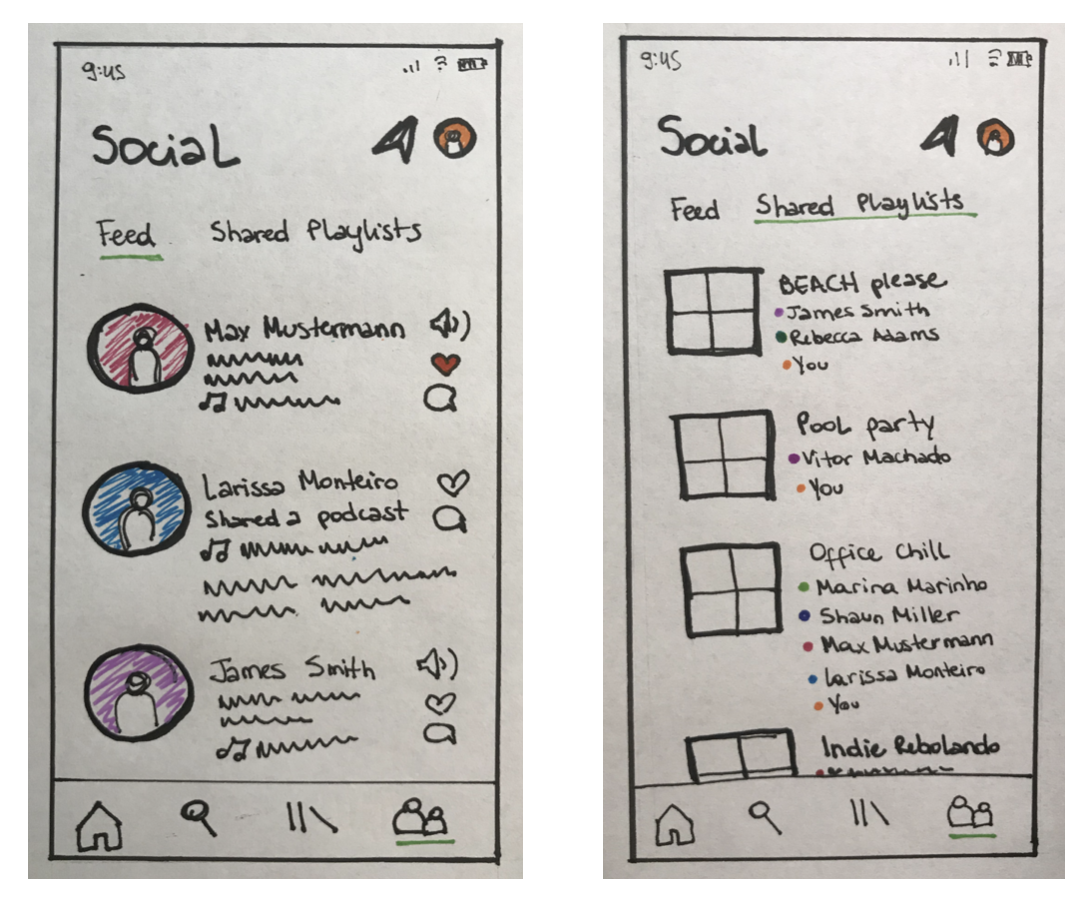
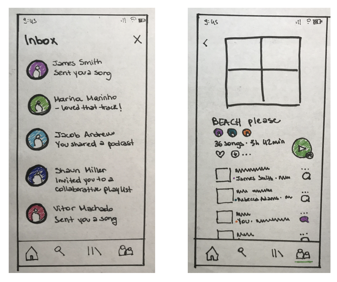
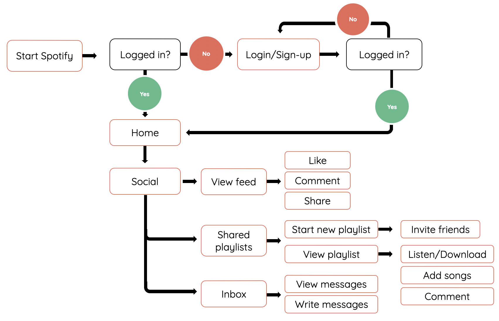
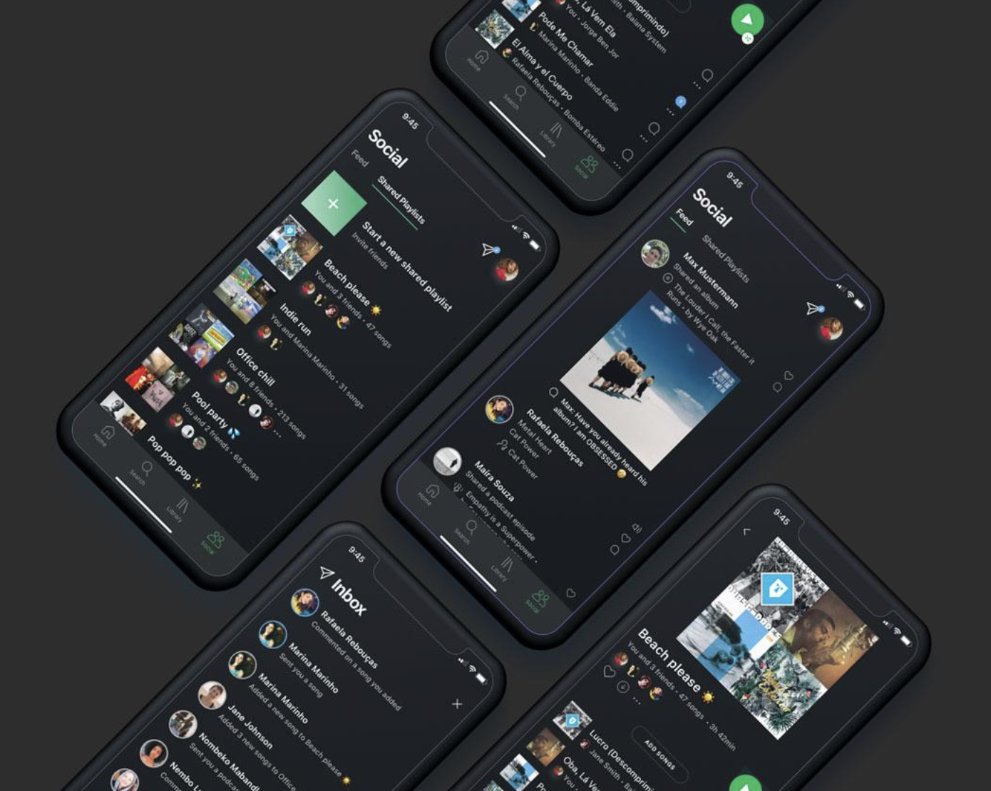
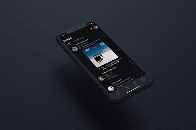
12. Bringing solutions to life
In this video, I’ll walk you through the user interface screens I’ve designed, highlighting key design decisions along the way.
I’ll explain the rationale behind each interaction, layout, and visual element — all rooted in user needs and research insights. This walkthrough aims to showcase how the design supports a seamless, engaging, and intuitive user experience.
13. Measuring success
If this solution would be implemented, a key indicator of success would be increased user engagement—measured by factors like session duration, feature usage, and interaction frequency. Higher engagement would suggest the design is both useful and compelling to users.

The expected result is more collaboration, the social side of the app will be more prominent.
It is also important that there are more shared playlists, with new features that assist collaboration. We want the new functions to be well received and generate high engagement.
KPI's: user engagement
14. Metrics
Other possible ways to measure impact using key metrics could be:
- North Star Metric: Increase in-app content sharing
- Number of likes and comments
- Volume of messages exchanged
- In-app user retention rates
- Number of new user registrations on Spotify
- Overall growth in streaming activity
- User feedback from app stores and social media regarding new features
15. Conclusion & nowadays
Interestingly, since completing my independent case study, Spotify has rolled out features and solutions that closely align with the concepts I envisioned.

See here my screen right next to what their shared playlists look like now. You can see that many elements are pretty similar to my proposal, such as the small avatars of users, the overview of who is in the playlist etc.

Seeing their recent updates reflect many of the ideas I proposed was a rewarding validation of my design approach and insights.
It highlights how the user-centered solutions I explored independently have now become part of Spotify’s evolving product experience.

Did you enjoy this case study?
Let's chat.

Drop me a line here or at alinethomedesign@gmail.com

Your message was sent ☺
I will get back to you as soon as possible!
Oops! Something went wrong while submitting the form.
Previous