UX Design & Research, INFORMATION ARCHITECTURE
Case study

Gympass – Partner's Portal

Gympass (now Wellhub) is a corporate wellbeing platform used by millions of users in several countries and languages.
It's global network offers thousands of options to promote employee health, digitally and in-person. These include offerings for nutrition, mental wellbeing, sleep health, productivity and physical activity.
4 million
users
65,000+
partners
50,000
gyms
15,000
companies
8,000
cities
11
countries
Problem Statement
Gympass' Partner's Portal is accessed by over 65,000 partners worldwide. This is the portal where gyms, personal trainers and all kinds of partners can access and edit their information on the platform, as well as access all class data.
As the company grew, their partner's portal expanded without proper planning. As a result, it ended up having way too many unstructured categories, which made users feel lost, having a hard time finding what they were looking for.
The main challenge here was to find a solution that would improve the portal's UX, making it more intuitive and easy to use.
My Contributions
I worked with Gympass (now Wellhub) between 2020 and 2021.
In that time I was hired as the sole responsible UX/UI designer for the Partner's Portal, with the aim of improving it's user experience quality.
I planned all the developments in this case study, which were then executed in close partnership with colleagues from different fields, such as:
- front and back end developers
- data analysts
- UX writers
- project managers

... among others.
1. Sitemap
The initial step to understand the Portal's problems was to map all pages.
This exercise exposed several consistency issues, since the pages of the Portal were very different from each other. It is clear that they were made at different times by different teams.
Another very obvious problem was that there were too many pages on the first level of the menu, which confused users. This happened because pages were created and added to the menu without the information architecture being revised or corrected.
Site map from Gympass' Partner's Portal
2. Finding usability technical flaws
The next step was to find and list usability technical flaws, page by page.
The list exposed what had already improved and what still needed to improve in general on the Portal.
Finally, a compilation was made of pages where the same data was repeated.
List of usability technical debts opn post-its and excel sheets
3. Portal's IA Matrix
Keeping all of the problems in mind, I developed a matrix with the portal's current information architecture state.
The opaque marbles are features that we did not yet have but were programmed to be done in the future.
The matrix makes very clear how we have too many items in the first menu level, the information was overly divided into several pages that did not go much deeper.
4. Data analysis
Before diving deeper into the restructuring of the portal, it is necessary to analyze the data we have that informs user behaviour. This was done by going into the portal's metabase, as well as checking all the analytics of user accesses.
This was essential to understand which were the most visited pages, which menu items were clicked on the most, etc. Compiling this data helped us get a clearer picture of our user behaviour.
This part of the process was done in collaboration with the data analysts and scientist in the company.
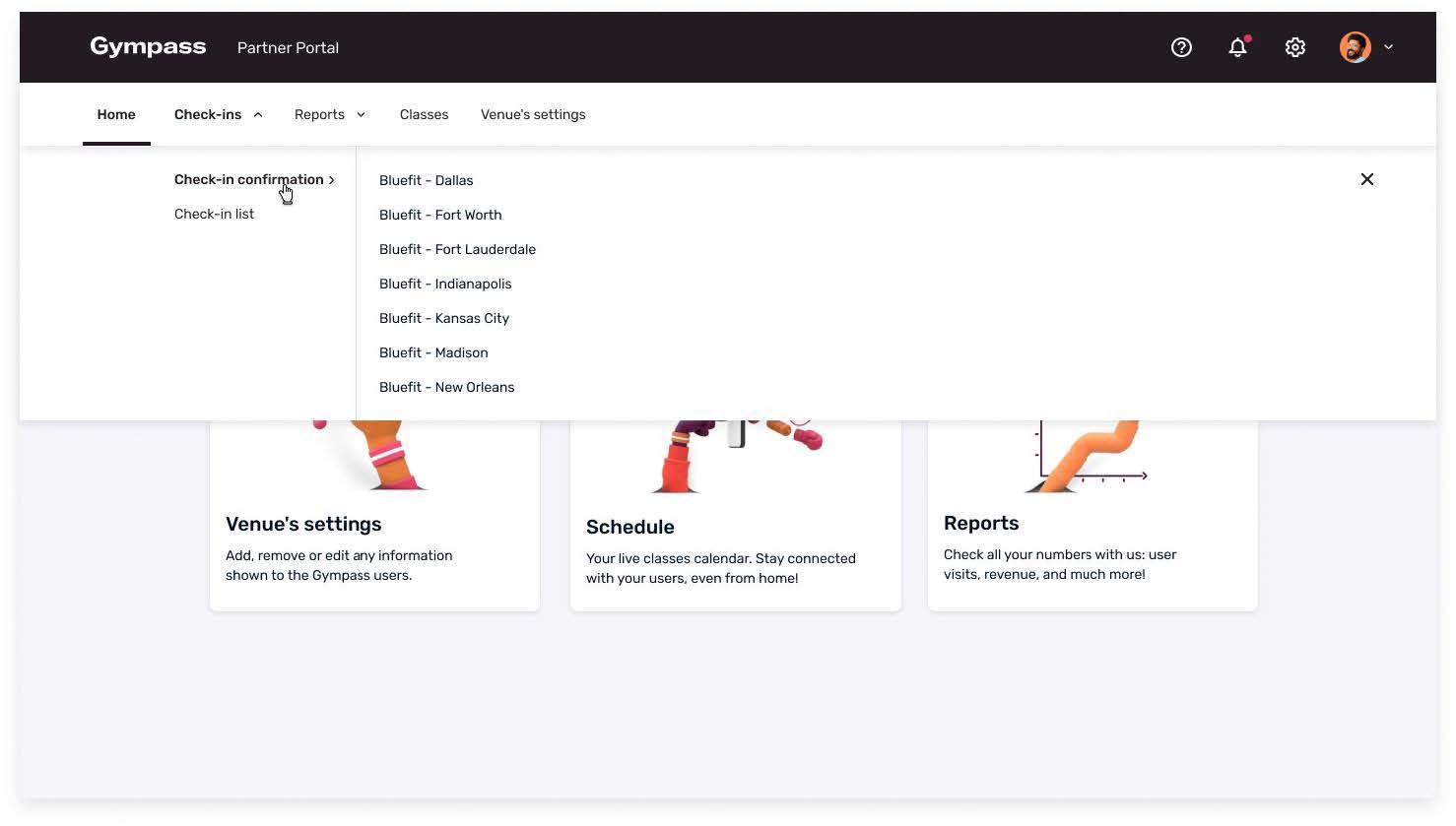
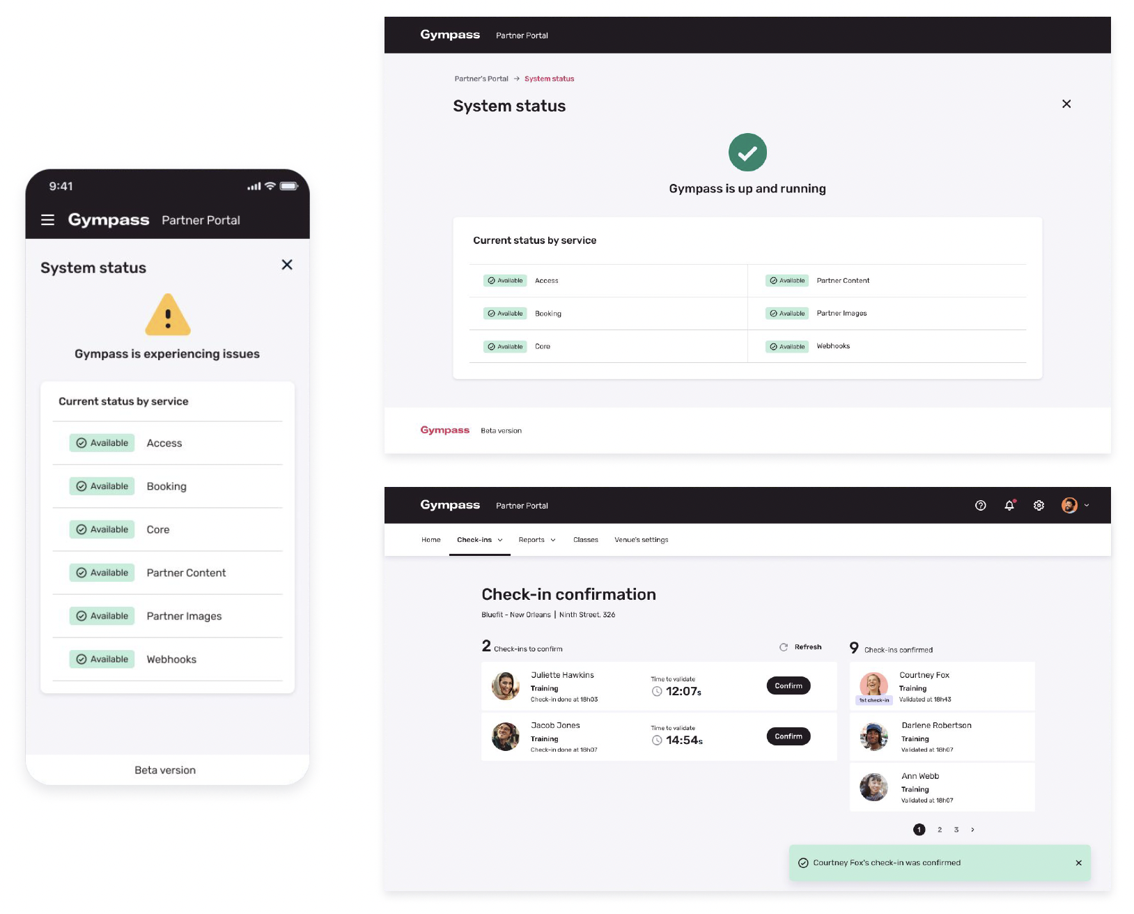
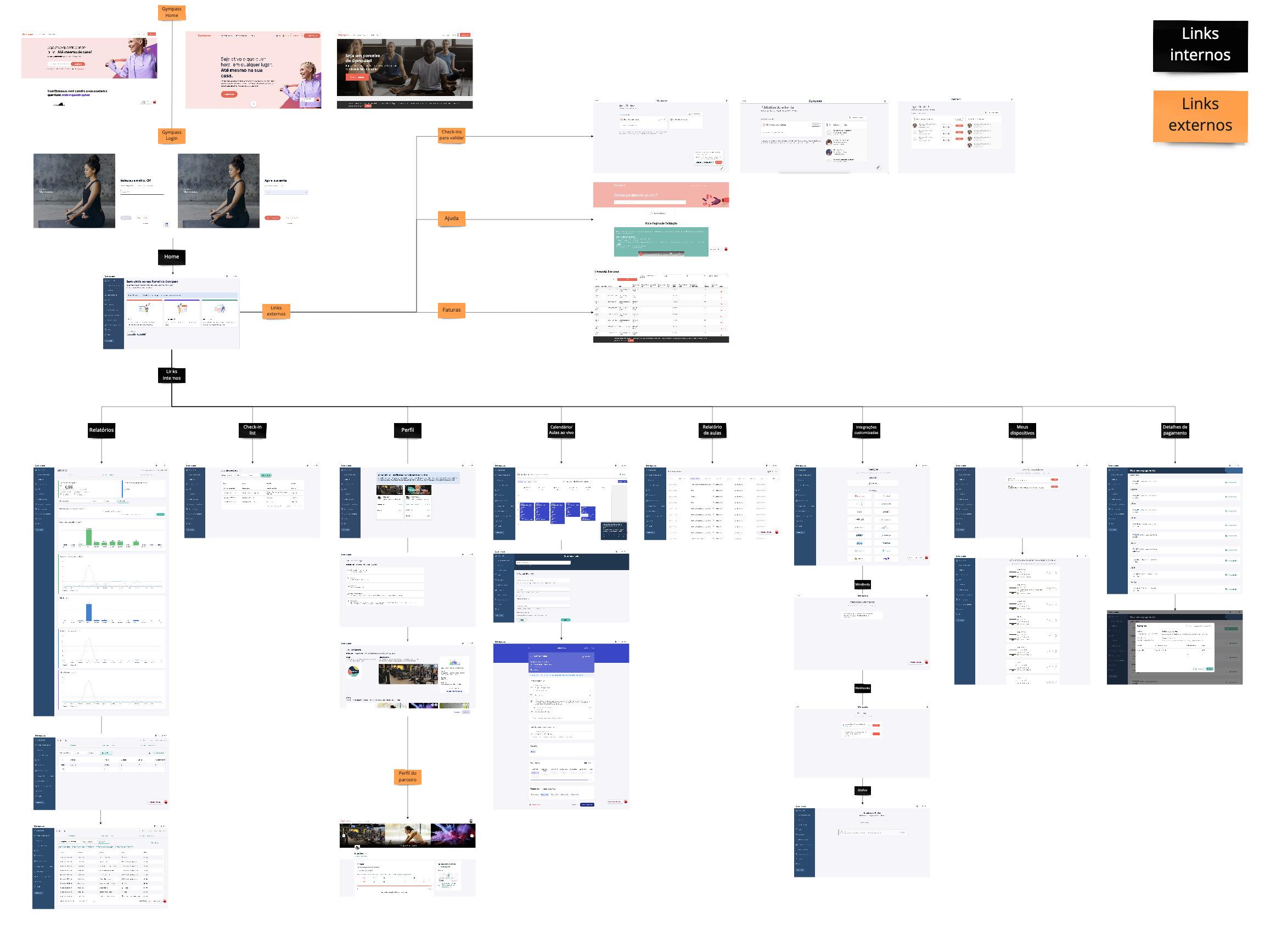
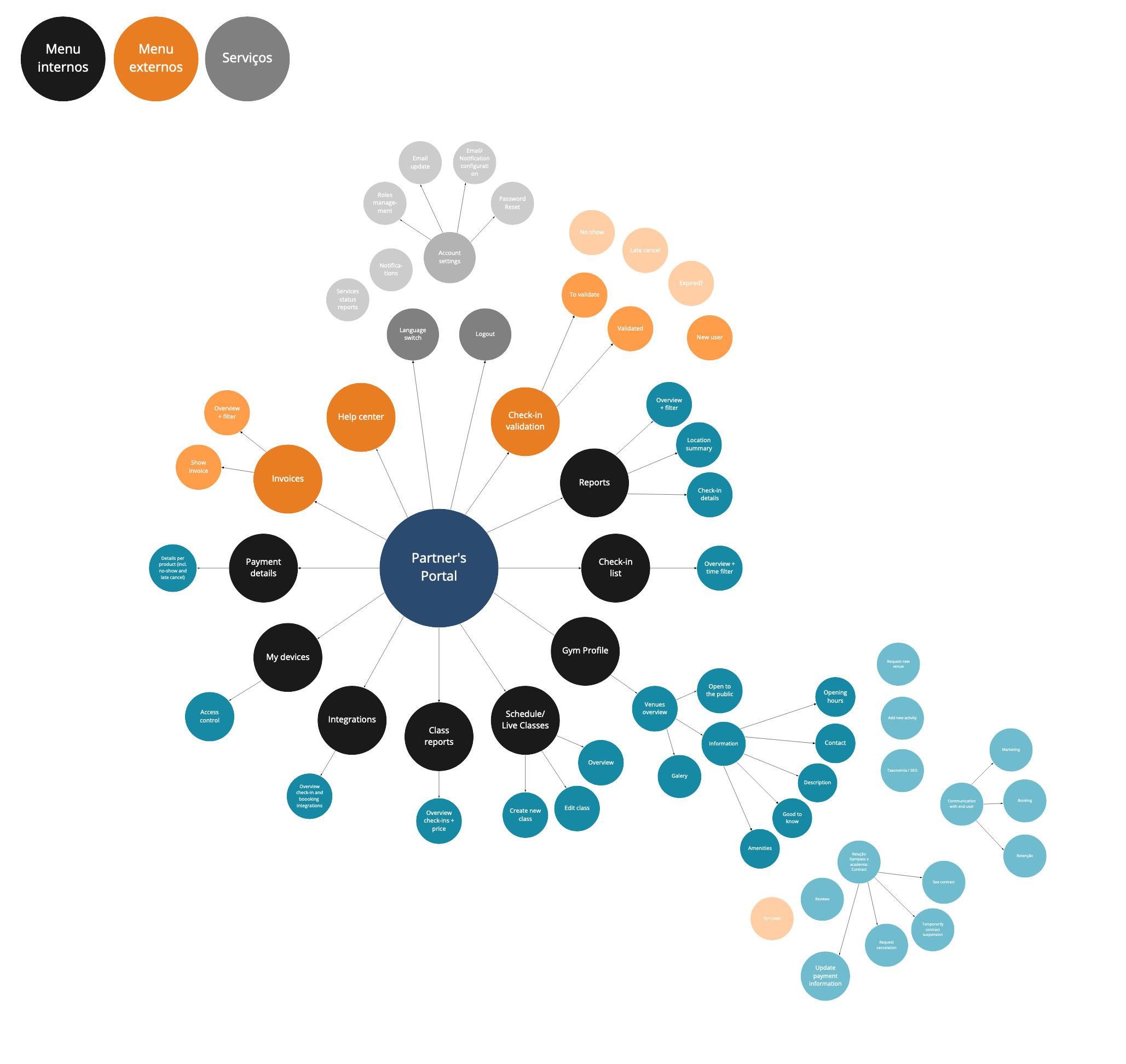
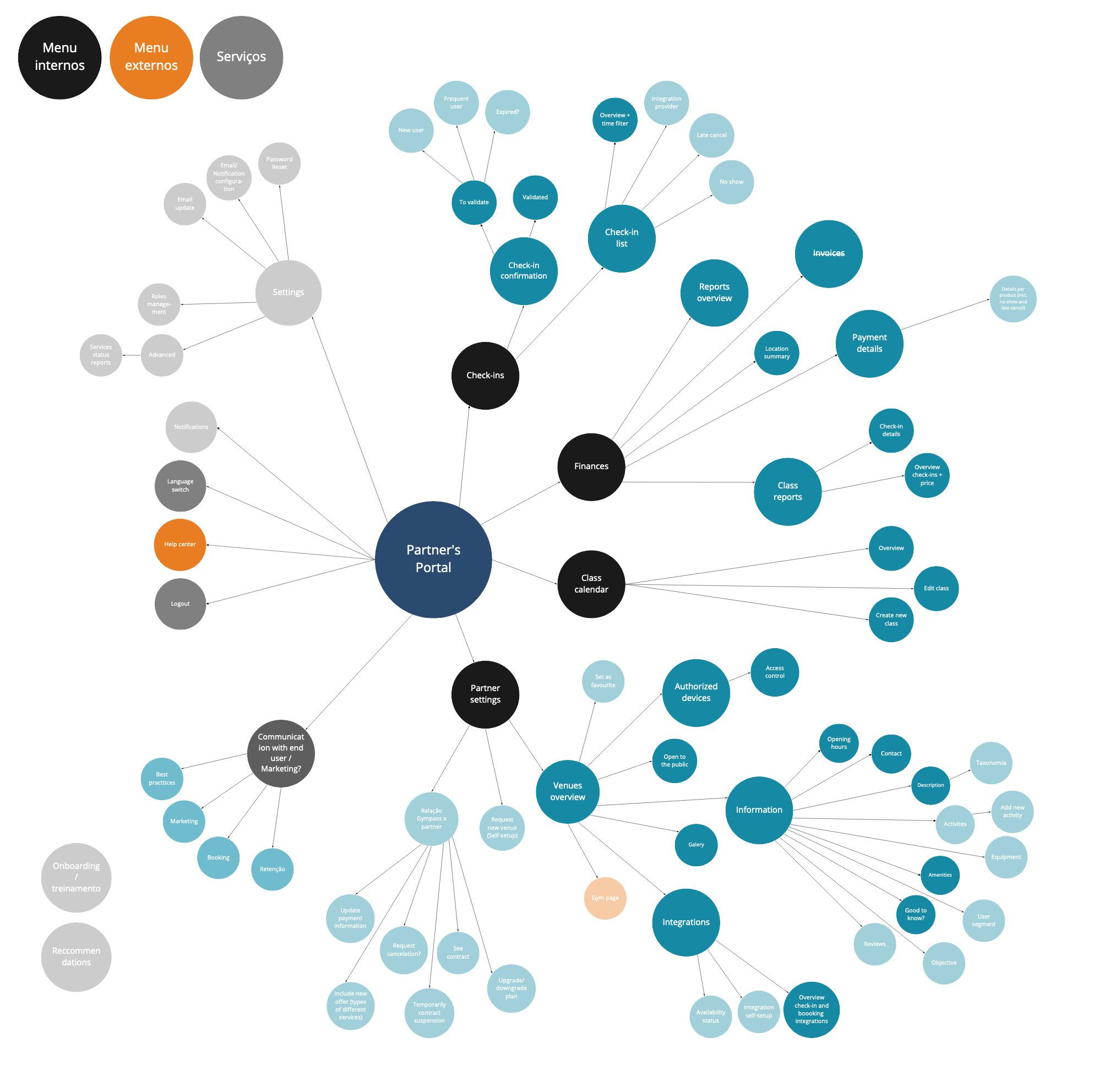
5. Portal's IA restructuration
Here is the proposal for restructuring the portal's information architecture. Having fewer, more macro categories at the first level can make the portal much more intuitive. The reason why is that, as users, we have trouble with menus that have more than seven items – ideally we should have five at most.
The idea is to have more levels, which are more intuitive and organised.
In this first view, the opaque dots are pages / functions that we didn't have yet. The goal would be to arrive at the next table, where we would have all the new features, in a restructured portal.
6. New navigation
With the new information architecture reestablished, a study was conducted considering the two main options we had for structuring navigation: horizontal and vertical.
After careful consideration, we decided to focus on the horizontal navigation.
Then, a prototype was created to be tested on User testing.
See PROTOTYPE ↗
7. User Testing
Tests were performed with tasks designed to test out the new portal structure and understand how well it would perform. The base for the tests was the prototype shown above.
Five out of five users could complete the task successfully, and all of them classified it as very easy to do.
Although the navigation worked well, there were some issues that will be listed in the next step.
8. User Feedback
After conducting the tests, the feedback we got from users was structured into what was working well and what needed attention. The topics that needed attention were then addressed.

9. Improvements
Based on the test results, we made adjustments on the UX writing to have more consistency, as well as respond to feedback from users.
Adjustments such as using "confirmation" instead of "validation", using alphabetic order to sort Partner's units and the possibility to have a geographical filter in cases where there are many venues.
10. Redesigned pages
Ultimately, the suggested improvements and changes were approved.
Besides what we already discussed, some other pages were redesigned.
Here are some of them.
Users were quite happy with a more structured portal, and in general it was easier and more intuitive to find what they were looking for.

Did you enjoy this case study?
Let's chat.

Drop me a line here or at alinethomedesign@gmail.com

Your message was sent ☺
I will get back to you as soon as possible!
Oops! Something went wrong while submitting the form.
Previous